We’ve discussed the disasters I’ve had and the improvements I made to my book covers but now I’ve decided to change again. ‘Why?’ you may ask. There are a number of reasons, some that I outlined in my previous blog but the driving force was that I wanted a consistent theme across all my book covers.
I want people to be able to look at a book cover and recognise it as one of mine in an instant. Most of my favourite authors have had a theme over the years. Think Iain Banks and his black and white theme or Christopher Brookmyre’s quirky font and bright colours.


Admittedly their books have different themes now but they were eye-catching.
Learning from my past mistakes I decided on three key components for my new theme. Bold colours, consistent easy to read font and one small graphic per cover.
Idle Threats was probably the easiest of the two. I already had the graphic I wanted with the Mexican death mask wearing a headset. It dominated the original cover however I made it smaller and I believe it is more dramatic because of that.
With the colours, I trawled Amazon for covers that I liked and looked for colours that worked together. I decided on three colours per cover. The main background colour, the one for the graphic and one for the font. I’d toyed with keeping the same colour font (black) throughout all of the books but it limited the number of options available to me.
I had a font that I really liked but after seeking feedback, question marks were raised about it so I looked for another, finally settling on Oswald Bold.
This wasn’t a standard font in Photoshop Elements so I downloaded it from 1001fonts.com. Crucially it was free for commercial use, something you will always need to check.
This is the final design. I think the colours contrast well with each other and it certainly catches the eye.

Leg It wasn’t quite as straightforward. I didn’t have the graphic and I had to resist the temptation to use any of the more obvious ones such as a football, ‘Keep Off The Grass’ sign, lighthouse etc.
Anybody who has read Leg It will know that there is a very funny story about a budgie. I created a cover with an empty bird cage but it felt like it was missing something so I added the upside down budgie. The cover hints at something but doesn’t give away the full story.
I got both images from Pixabay.com, again free for commercial use, and merged them in Photoshop, creating an outline with far more skill than I possessed when I did the original cover. I’m still very much a Photoshop novice but Google and YouTube videos are a Godsend.
I’d gone for a blue theme but the general consensus was that it was a bit dull and not bold enough. The orange is close to the yellow of Idle Threats but I believe there are sufficient differences. They are part of the same series so I think it will work with them being similar.
I tried with a black font but it didn’t work so settled on white. The name ‘Leg It’ has also caused me problems. Ideally I would have both words on one line but it runs the risk of looking like ‘Legit’ so put it over two lines and therefore did the same with Idle Threats.
I think you’ll agree that the end result is a step up from my first attempts six years ago.

Once I’d gone through the feedback process with my writing group and some trusted friends, I went about the process of updating the covers and realised how much I had forgotten from the last time around.
First things first, I made sure that both covers were consistent. Same sizing and positioning of text, graphics etc. I was tearing my hair out at times but once I worked out how to use guides (incredibly simple task) in Photoshop, things became easier.
Kindle was probably the easiest. They have very simple guidelines on sizing etc so I set everything up in Photoshop, made a JPG and updated it in KDP. It took about 48 hours to update.
Kobo was the same but hardly anybody buys on there so it wasn’t worth much effort.
I currently use Createspace for the paperback. I had the original templates for the covers so it was a case of replacing the front cover and creating a new spine and back page. Not too much of a challenge if you have basic Photoshop skills.
I updated everything and got a confirmation email 24 hours later to say the changes were approved. It should take 48 hours to update from there however it took just over a week for Leg It to be fully updated. There has been a long Bank Holiday Weekend so I will leave it a day or so before raising it.
iBooks was altogether more difficult but only because I had forgotten the process. It isn’t as simple as just updating the cover and you have to resubmit the whole book.
I write my novels in Scrivener and compile from there but it wasn’t clear what my next step was. It’s a little convoluted but in simple steps it is as follows.
Add new cover into Scrivener on compile page and leave the iBooks only box unticked.
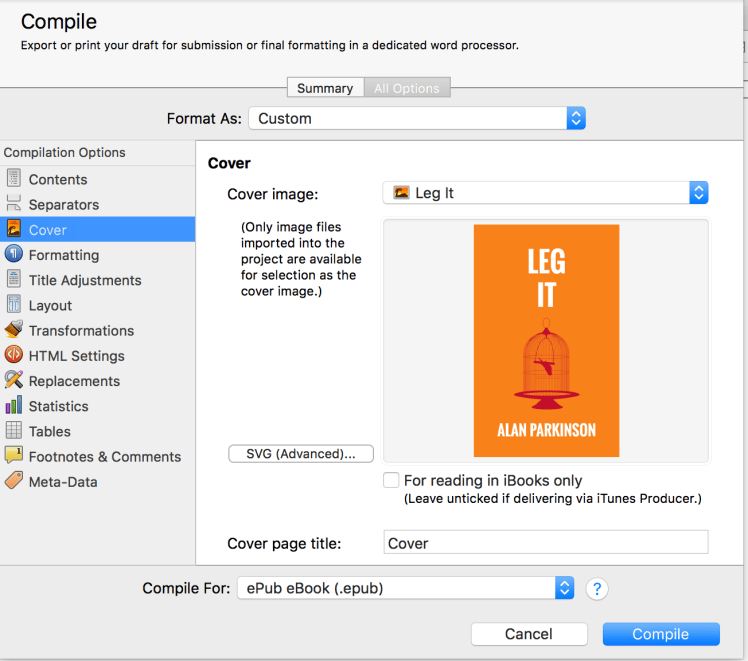
Compile as ePub. Open iBooks Author and follow the process for creating new book from ePub file. You will be given the option to select that it is an update of an existing iBook and select one from your list. Once you’ve gone through the whole process you can send it to iTunes Producer and submit it to iBooks from there. It only takes a couple of hours to get approved and updated. Not as difficult as it seems but as you use iTunes Connect to manage your account it does seem very counter intuitive to use so many different apps for the one process.
Next I had to update everywhere that I use my book covers. Website, Twitter, Facebook, even a message board where I use Idle Threats as my avatar. Everything needs to be consistent as, whilst I hate using this word, it is your brand.
Now that everything is updated, I just have to sit back and wait for the sales to roll in. (If only it were that simple.)
The cover for novel number three is almost complete however I haven’t fully decided on the name. The length of the name could cause me issues for the cover with it being far longer than the two words in my current novels. I’m almost sure of the colours and the graphic is nearly there but there’s plenty of time for me to decide.
If you have any feedback or comments please let me know.

I love the Leg It cover – that’s really eye catching. Great job!
LikeLiked by 1 person