In my previous blog I discussed some of the awful mistakes I made with book covers in the early days so it is no surprise that when I came to publish my second novel, Idle Threats, I decided that I needed some help.
The dilemma that every self-publisher will face is knowing when and where to spend money. In an ideal world we’d get professional editors, spend a fortune on advertising and get the best book cover that money can buy. Unfortunately most of us live in the real world where money is tight so we have to prioritise.
Every penny you spend as a self published author is a gamble and you never know whether it will pay off. There are many options open to you and a variety of price ranges. I’m not going to go through all of them here but I chose one of the cheaper options.
A colleague was looking to build his graphic design portfolio and showed me some examples of his work. Whilst it wasn’t his profession (he was a software tester) I was suitably impressed and as I already knew I could work with him, we decided to give it a go.
The slight stumbling block was price, not that he was asking too much, just that neither of us knew how much he should be charging and were too polite to bring it up. It’s worth getting this out in the open early on if you are working with someone. We came to an agreement that I hope we were both happy with and he began work on it.
I gave him a brief overview of what Idle Threats was about and let him come up with some ideas. There’s a slight Mexican theme going through the novel so Craig quite quickly came up with the idea of a Mexican death mask. This worked for me and it wasn’t long before he came up with a first draft.
We went through a few iterations, most crucially adding a headset to the mask as the novel is set in a call centre and we agreed on something we were both happy with. The colour scheme, whilst we didn’t notice at the time, was probably inspired by the application he was testing at the time.
With both of us satisfied, this is the finished product that we decided to go with.
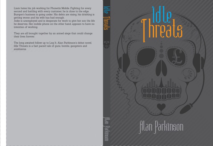
The colours worked well together however in hindsight I’ve realised that good design and good book cover design aren’t necessarily the same thing. The theme was too dark and didn’t stand out enough. This wasn’t a fault of Craig’s, he designed to my spec but I’ve come to realise over the past year that I hadn’t considered things like photoshoots etc and only thought about the thumbnail on Amazon.

Similarly the font, whilst looking good and being decent colours, possibly wasn’t as big as it needed to be. Plenty of people saw it before publication and not one of us considered it to be an issue, it comes with experience, learning what works and what doesn’t.
The Mexican death mask was a big success however and has appeared on merchandise from mugs to jigsaws, phone covers to fridge magnets. My niece had great fun planting flyers in the antique shops in her home town and proudly sported an Idle Threats t shirt to school.


Happy with Idle Threats, I asked Craig to have a go at redesigning Leg It. We didn’t spend as much time on this and I think I allowed myself to be influenced by previous covers. The graffiti was back albeit in a different style and we got the ‘Keep Off The Grass’ sign and the football that had featured in the earliest cover. We deliberated for hours over the colour of the font. The football was more likely to appeal to men whilst my readers were more often female. We went from blue to pink in possibly a very basic thought process about what colours appealed and after seeking a lot of opinions, we settled on purple.

The colours worked a lot better than Idle Threats as they were brighter but, again with the benefit of hindsight, the football dominates and gives the wrong impression of what the book is about. I’ve heard a few people say that they think the book is about football where it only forms a small part of it.
It was a huge improvement on what had gone before and I’ve sold far more versions of this paperback than the original design. The original now becoming a ‘collector’s edition’ as it is discontinued.
One final change I made was to change the finish of the paperback from gloss to matte when Createspace introduced the option. It’s personal preference but I think it looks more professional.
This has been the cover since August 2015 but with the new novel coming up, I’ve decided on some big changes and I will cover those in my next blog.
